
Utilisation is very good at explaining what already happened. It’s much less useful at showing where things are likely to break next.
This is key, especially in professional services, where delivery risk builds slowly through small reallocations, skill bottlenecks, reshuffled plans, and pressure concentrating in places leaders don’t always see.
As a product leader working closely with operations, delivery, and sales teams, I’ve learned that the real question is “what is utilisation actually telling us about risk, predictability, and sustainability?”
This blog covers:
- Why utilisation is a lagging signal
- How delivery risk shows up first
- Why averages create false confidence in complex organisations
- How leaders who feel “in control” focus on pressure, stability, and skills
Utilisation measures effort. Delivery risk lives somewhere else.
Utilisation tells you how busy people were over a period of time. That’s useful, and finance teams rely on it for good reasons.
However, delivery risk is a different matter entirely.
Delivery risk comes from how fragile your plans are. How much slack exists. Or how dependent outcomes are on a small number of people, skills, or assumptions holding true.
You can see why these get confused. When work goes well, high utilisation and low risk often coexist. So we start treating the utilisation number as proof that everything else is fine too.
You can’t do this too often before it bites you, though.
Over time, I’ve found it helpful to think about utilisation as a compression metric. It collapses a lot of complexity, including different roles, skills, time horizons, and trade-offs, into a single percentage. In fact, the numbers tell the story clearly. Service Performance Insight's 2025 benchmark data shows billable utilisation has fallen steadily from 73.2% in 2021 to just 68.9% in 2024, dipping below the critical 75% threshold that most firms target for sustainable operations.
Delivery risk expands that complexity back out, which can be uncomfortable, because it forces you to look at things the average hides, such as uneven load, constant reshuffling, critical skills stretched thin, and plans that only work if nothing unexpected happens.
Here’s my simple working model:
- Utilisation answers: “How much capacity did we use?”
- Delivery risk answers: “How likely is this plan to hold under pressure?”
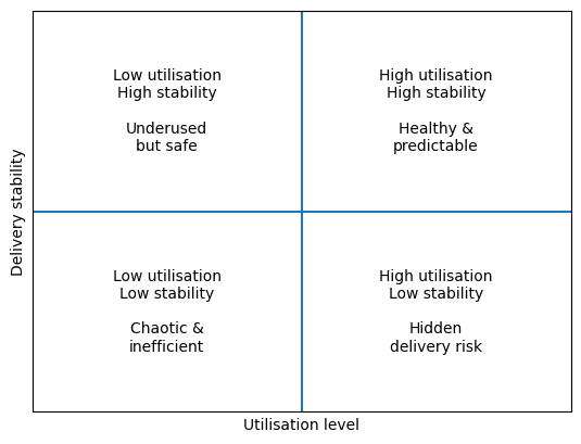
Essentially, two teams can be equally busy and carry very different levels of risk. One operates with stable allocations, clear skill coverage, and realistic buffers. The other relies on constant adjustment and a handful of people holding everything together.
On paper, they look identical. In reality, one missed assumption away from trouble.
This brings me to the first place where utilisation misleads leaders. →
Lesson #1: The average hides where pressure is really building

This is the mistake I see most often. We take a single utilisation number, usually an average across a team or function, and treat it as one of the most important metrics.
You can see the problem here.
An average tells you nothing about how work is actually distributed.
I’ve worked with teams where the headline number looked completely reasonable, while a small group of people were consistently overloaded and another group struggled to stay meaningfully engaged. Both conditions create risk. They just show up in different ways.
Overloaded people become single points of failure. Knowledge concentrates. Burnout creeps in. Underused people disengage, lose context, or leave, often just as demand finally catches up with them.
Meanwhile, the average barely moves.
Here are two examples.
In one team, work was spread relatively evenly. A few people were busy, a few had breathing room, and most sat somewhere in between. Plans held because pressure wasn’t concentrated anywhere fragile.
In another, a handful of specialists carried the bulk of the load. Every change, every escalation, every “can you just help with this?” landed on the same names. Delivery depended on those people staying healthy, available, and motivated.
Both teams reported similar utilisation. Only one was actually safe.
In fact, research from ManpowerGroup reveals that 75% of employers globally struggle to find skilled talent, with professional and business services experiencing a 50% unfilled position rate. When pressure concentrates on the few people who have critical skills, you know you’re in an untenable situation.
The takeaway: Before asking whether utilisation is “too high” or “too low,” ask where the pressure is sitting and whether you’re comfortable with how fragile that makes your plan.
Lesson #2: Volatility is the early warning sign everyone ignores

Once you start looking past averages, the next thing that stands out is movement.
This can be hard to do. When plans are changing constantly, it often feels like the organisation is being responsive. People are jumping in. Problems are getting solved. Work is moving.
But over time, I’ve learned that high volatility is usually doing the opposite.
When individuals or teams swing repeatedly from under-allocated to over-allocated, it’s a sign the system is struggling to absorb demand.
Maybe you’ve taken a bunch of steps to improve planning in situations like this. Better forecasts. Tighter handovers. More frequent reviews.
But it’s not enough, and we need to do more.
People feel it first as constant context switching, re-prioritisation, and “just for now” changes that become permanent. The pressure shows up in other ways, too. Grant Thornton's 2024 State of Work survey found that 51% of employees experienced burnout in the past year, up 15 percentage points from the previous year. The top driver? Mental and emotional stress at 63%, followed by long hours at 54%. That kind of sustained strain doesn't come from stable, predictable work patterns.
Herein lies the difficulty.
Every reshuffle introduces friction. Knowledge gets dropped. Momentum resets. Delivery becomes dependent on heroics rather than systems.
Key takeaway: Volatility is a sign the system is struggling to absorb demand, forcing teams to rely on 'heroics' and constant reshuffling instead of stable processes.
Lesson #3: By the time utilisation looks bad, the team already knows

This is where utilisation’s lag really starts to hurt.
I’ve lost count of the number of times a delivery issue was escalated at exactly the moment the utilisation report finally caught up. On paper, the problem had just appeared. In reality, the team had been compensating for weeks.
But people feel pressure long before it shows up in the numbers. For instance, they stop taking leave, work around constraints instead of fixing them, or absorb risk to keep things moving.
Meanwhile, the dashboard still looks fine.
This brings me to the next lesson: time matters more than precision.
Backward-looking utilisation explains history. It tells you what capacity was used last month or last quarter. That’s useful for reporting, but it doesn’t help much when you’re trying to decide what to do next.
Forward-looking pressure is messier; it’s less certain and forces uncomfortable conversations earlier than most organisations are used to.
But when leaders can see pressure building ahead (even imperfectly) they still have options. They can delay work. Rebalance teams. Adjust scope. Bring in help before everything is already stretched.
Once utilisation spikes, those options disappear. At that point, you’re managing consequences, not choices. The data backs this up too. SPI Research found that on-time project delivery rates dropped from 80.2% in 2021 to just 73.4% in 2024. That's nearly three in ten projects missing deadlines, but the utilisation reports likely looked fine right up until delivery failed.
The takeaway: If your reporting only tells you how busy you were, it’s already too late to change the outcome.
Lesson #4: Capacity only helps when the right skills exist

This is where a lot of delivery risk becomes effectively invisible.
On paper, capacity looks like a simple math problem. You have people. You have hours. If the numbers line up, the work should flow.
In practice, it rarely works like that.
I’ve tried dozens of ways of planning around this, and the same issue keeps surfacing: not all capacity is interchangeable. Some skills sit directly on the critical path. When those skills are stretched or misallocated, everything else slows down, even if overall utilisation looks fine.
A team might have plenty of available hours, but if the people with the specific expertise needed at that moment are already overloaded, the plan is fragile. Work queues up. Decisions get delayed. Less experienced people step in and do their best, but risk increases.
Meanwhile, utilisation stays reassuringly average.
This shows up most clearly in specialist roles. A handful of people end up acting as informal bottlenecks because they’re the only ones trusted to handle certain work. They become the default solution to every problem.
That’s not a people issue. It’s a visibility issue.
When leaders can’t clearly see how demand lines up against specific skills, they plan around headcount and hope experience fills the gaps. Sometimes it does. Often it doesn’t.
The takeaway: Delivery risk concentrates around skills long before it shows up in capacity numbers.
What leaders who feel “in control” actually do differently
The leaders who feel calm about delivery ask better questions, earlier, with less reliance on a single number to reassure them.
They still look at utilisation, of course.
But they also pay attention to a small set of metrics that, taken together, tell them whether the system is holding or straining.
- They notice where pressure is concentrating rather than whether the average looks fine.
- They pay attention to how often plans change, not just whether targets are met.
- They look ahead just far enough to spot discomfort early, even if the picture isn’t perfect.
- And they stay curious about skills, including which are doing too much work, and which are missing when demand lands.
This type of mindset changes the conversation.
Instead of debating whether utilisation should be 78% or 82%, leaders start asking:
- Where would this plan break first?
- Who is absorbing the most risk right now?
- What assumptions are we relying on staying true?
These questions require visibility, honesty, and a willingness to surface issues before they become unavoidable.
The takeaway: Control comes from seeing pressure clearly enough to act while you still have options.
Final thought: False confidence is expensive right now
Clients expect predictability. Teams have less slack. Hiring your way out of pressure isn’t always an option. And missed delivery commitments compound quickly, both reputationally and financially.
That’s what makes blind faith in utilisation risky.
A single percentage can look reassuring while pressure concentrates, plans destabilise, and critical skills carry more load than anyone realises. By the time the number finally moves, the organisation is already reacting rather than choosing.
If you’re relying on utilisation to tell you whether delivery is healthy, there’s a good chance you’re seeing the story too late.
Retain helps delivery and operations leaders move beyond headline numbers by bringing together visibility of demand, capacity, and skills — so risk shows up earlier, while there’s still room to act.
If you want to understand where pressure is building in your organisation (and why) it’s worth seeing how that visibility looks in practice.
→ Book a personalised Retain demo

